
Definition
There are two Widgets allowing to configure the display /edit of numbers (integer, decimal) attributes.
-
Number Input Edit
-
Number Display
|
Number Input Edit |
Number Display |
|---|---|

|
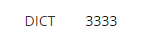
|
Configuration
Properties
|
Properties name |
Type |
Mandatory |
Description |
Values (default value in bold) |
Edit |
Display |
|---|---|---|---|---|---|---|
|
required |
|
NO |
Defines if the attribute is mandatory or not. |
true, false |
|
|
|
decimals |
|
NO |
Defines the authorized decimals of the attribute.
Only if the type = DECIMAL NUMBER |
0, 1, 2, 3... |
|
|
|
forceStepDivisibility |
|
NO |
Used to specify how to force the value to be divisible by step |
none, round, floor, ceil |
|
|
|
max |
|
NO |
Defines the maximum value that can be entered by the user. If the indicated value is greater than the maximum value, by default, the maximum value will be indicated in the field. |
0, 1, 2, 3... |
|
|
|
min |
|
NO |
Defines the minimum value that can be entered by the user. If the indicated value is smaller than the minimum value, by default, the minimum value will be indicated in the field. |
0, 1, 2, 3... |
|
|
|
suffix |
|
NO |
Defines a value after the field. |
- |
|
|
|
prefix |
|
NO |
Defines a value before the field. |
- |
|
|
|
step |
|
NO |
Defines an increment/decrement value. |
0.0 |
|
|
|
verticalButtons |
|
NO |
Allows to choose the display of the "plus" and "minus" buttons. |
true, false |
|
|
|
verticalDownClass |
|
NO |
Defines the icon to display inside the button.
|
fa fa-"name of the icon" |
|
|
|
verticalUpClass |
|
NO |
Defines the icon to display inside the button.
|
fa fa-"name of the icon" |
|
|
|
backgroundColor |
|
NO |
Defines the displayed background color. |
Standard CSS color value, #ffffff |
|
|
|
bold |
|
NO |
Defines if the value is displayed in bold or not. |
true, false |
|
|
|
fontSize |
|
NO |
Defines the displayed size. |
INHERIT, XX_SMALL, X_SMALL, SMALL, MEDIUM, LARGE, X_LARGE, XX_LARGE |
|
|
|
italic |
|
NO |
Defines if the value is displayed in italic or not. |
true, false |
|
|
|
textAlign |
|
NO |
Defines where the text is aligned when displayed. |
LEFT, CENTER, RIGHT |
|
|
|
textColor |
|
NO |
Defines the displayed text color. |
Standard CSS color value, #000000 |
|
|
|
underline |
|
NO |
Defines if the value is underlined or not. |
true, false |
|
|
Example
|
Number Input Edit |
Number Display |
|---|---|
|
XML
|
XML
|
Read Next
- Features
Design screens and business features to manage objects.