Definition
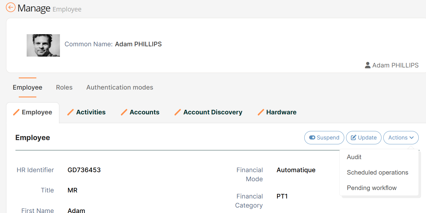
The Button Dropdown Widget allows to display a button on a feature with a dropdown list in which there are several buttons, allowing to redirect the user to other features.
This Widget has the same properties as the Button Widget but includes other properties to define the dropdown list (see below).
Configuration
Properties
|
Property name |
Type |
Mandatory |
Description |
Values (default value in bold) |
|---|---|---|---|---|
|
- |
NO |
Allows to define the list of redirection to features. |
- |
entries properties
|
Property name |
Type |
Mandatory |
Description |
Values (default value in bold) |
|---|---|---|---|---|
|
- |
NO |
Allows to define properties of each redirection. This tag is configured as many times as we want to add links. |
- |
entry properties
Each entry will have the following configuration:
|
Property name |
Type |
Mandatory |
Description |
Values (default value in bold) |
|---|---|---|---|---|
|
authenticationLevelSufficient |
|
NO |
Used to define if the feature is "sensitive" or not. If true, to access the Feature, the user will have to upgrade his/her authentication level (see settings BUM). |
true, false |
|
divider |
|
NO |
Allows to organize the dropdown list by inserting a dividing line after the link. |
true, false |
|
icon |
|
NO |
Used to define the icon to be displayed inside the button. |
For available icons, see https://fontawesome.com/v4.7.0/icons/ fa fa-"name of the icon" |
|
id |
|
NO |
Used to define the id of the feature. |
- |
|
target |
|
NO If no target is defined, the button will have no action. |
Used to define the redirection of the user to another feature. This is a polymorphic property that can be of three different types: ButtonLinkTarget
Allows to configure a link that will open in the current tab or a new tab. The “target” property can take two values: SELF = open link in same tab NEW_TAB = open link in a new tab XML
ModalWidgetTarget
Open a Widget in a modal dialog (for such an action as: reset a password, role dashboard, ...). The size of the dialog can be controlled by defining a display option on the widget (modalSize : XS ,SM,LG) XML
ModalTarget
Allows to configure a link that will open in a modal dialog. It is similar to the widgetToOpen case but the modal is fully routable using the (secondary:…) url pattern. The “onDismiss” property control the behaviour of the primary route (the one behind the modal) after the modal is dismissed. NONE = Do nothing REFRESH = Refresh the primary route XML
SidePanelTarget
Allows to configure a link that will open in a sidepanel on the right. The sidepanel is fully routable using the (sidepanel:…) url pattern. The “onDismiss” property control the behaviour of the primary route (the one behind the sidepanel) after the sidepanel is dismissed. NONE = Do nothing REFRESH = Refresh the primary route XML
|
For a link to a feature: feature://<featureId>/{dataKey.id} For a hub Feature: feature://user-hub.user-card-read/{dataKey.id} For a link to a user task: task://<action>/<id>
|
Example
|
Code |
|---|
|
Link configuration
|
|
Widget To Open configuration |
|
Modal target type |
|
SidePanel target type HTML
|
Read Next
-
Button Widget Allows to display a button on a feature, in order to redirect the user to another feature.
-
Button Dropdown Widget -
Button Group Widget Allows to display a group of buttons on a feature, in order to redirect the user to other features. This widget cannot be used in the frame actions