Definition
The Technical Dashboard is a widget that allows administrators to view all distributed batches in a technical overview.
It is a Self-only active widget. Its purpose is to monitor the platform's status.
Configuration
Properties
|
Property name |
Type |
Mandatory |
Description |
Values (default value in bold) |
|---|---|---|---|---|
|
counterColor |
|
No |
A Metronic theme CSS color for the counter number (ex: “dark”) or a HEX color (ex: “#333333). |
dark |
|
borderColor |
|
NO |
A Metronic theme CSS color for the counter border (ex: “dark”) or a HEX color (ex: “#333333). |
grey |
|
loadLineColor |
|
NO |
A Metronic theme CSS color for the load line (ex: “red”) or a HEX color (ex: “#333333). |
red |
|
effectiveModeratorLineColor |
|
NO |
A Metronic theme CSS color for the effective moderator line (ex: “green”) or a HEX color (ex: “#333333). |
green |
Example
<widget id="technical-dashboard-widget" xsi:type="ctdbum:TechnicalDashboardWidgetType">
  <hidden>false</hidden>
  <displayOptions>
    <modalSize>LG</modalSize>
  </displayOptions>
  <config>
    <bordered>false</bordered>
    <title>true</title>
    <display>
      <counter>
        <borderColor>#CBD4E0</borderColor>
        <counterColor>#5A6C88</counterColor>
      </counter>
      <xyChart>
        <effectiveModeratorLineColor>#629ABC</effectiveModeratorLineColor>
        <loadLineColor>#7E56F7</loadLineColor>
      </xyChart>
    </display>
  </config>
</widget>
Use
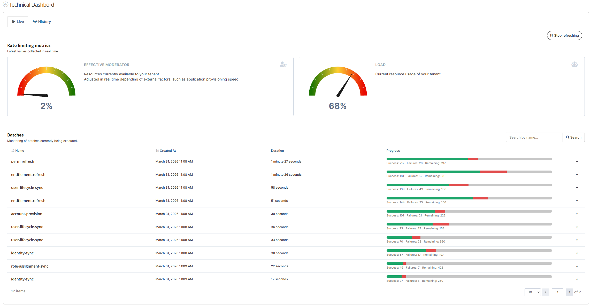
The Technical Dashboard widget is separated into two tabs: Live and History.
1) Live tab
Counters
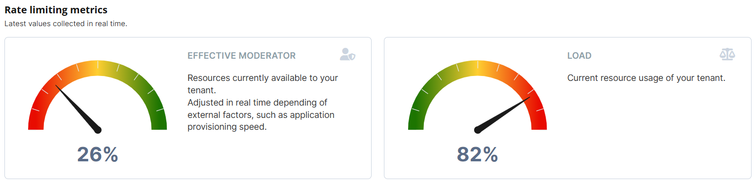
The "counter" section corresponds to the Rate Limiting Metrics. We display the latest values collected in real time.
List
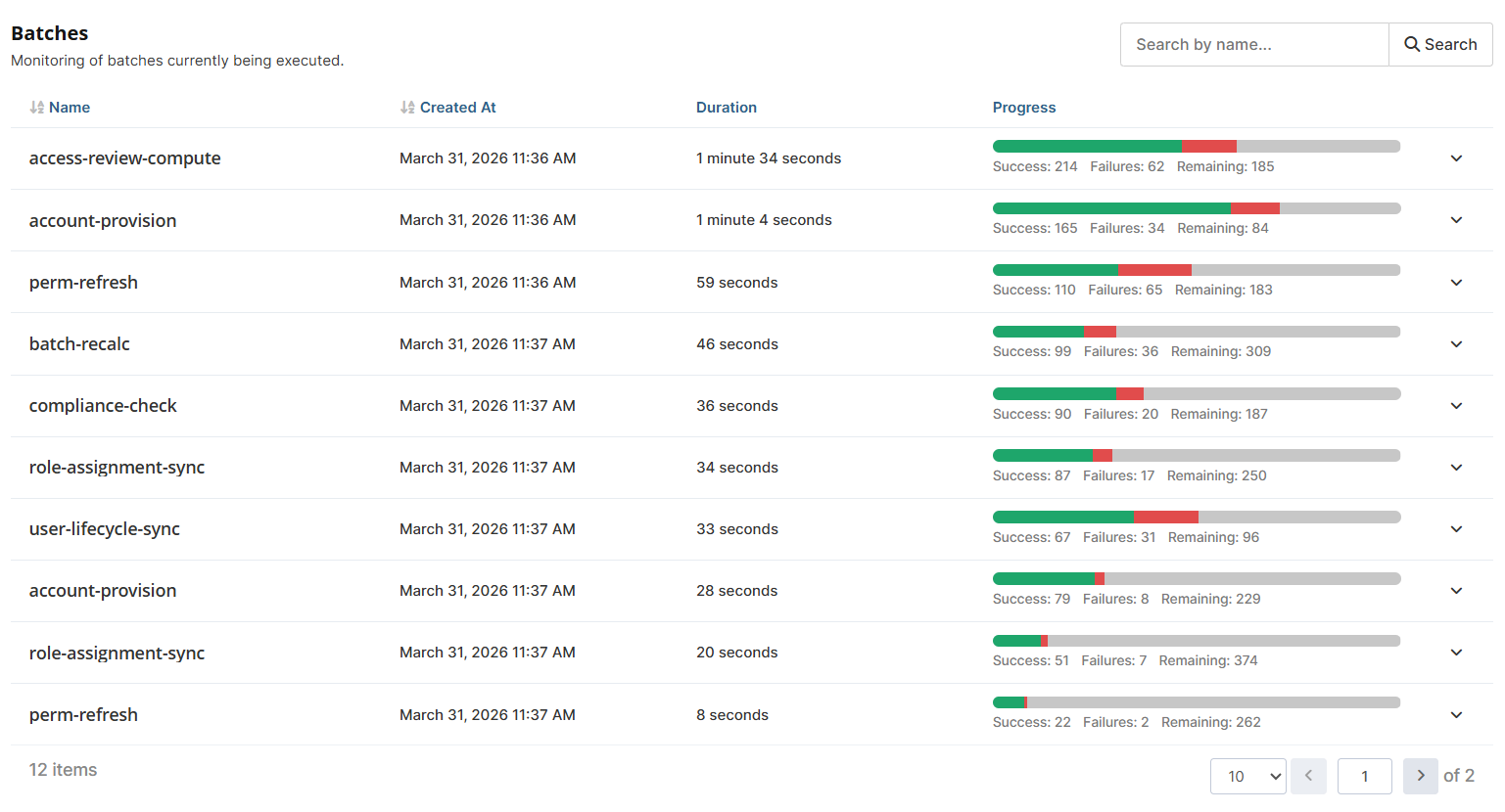
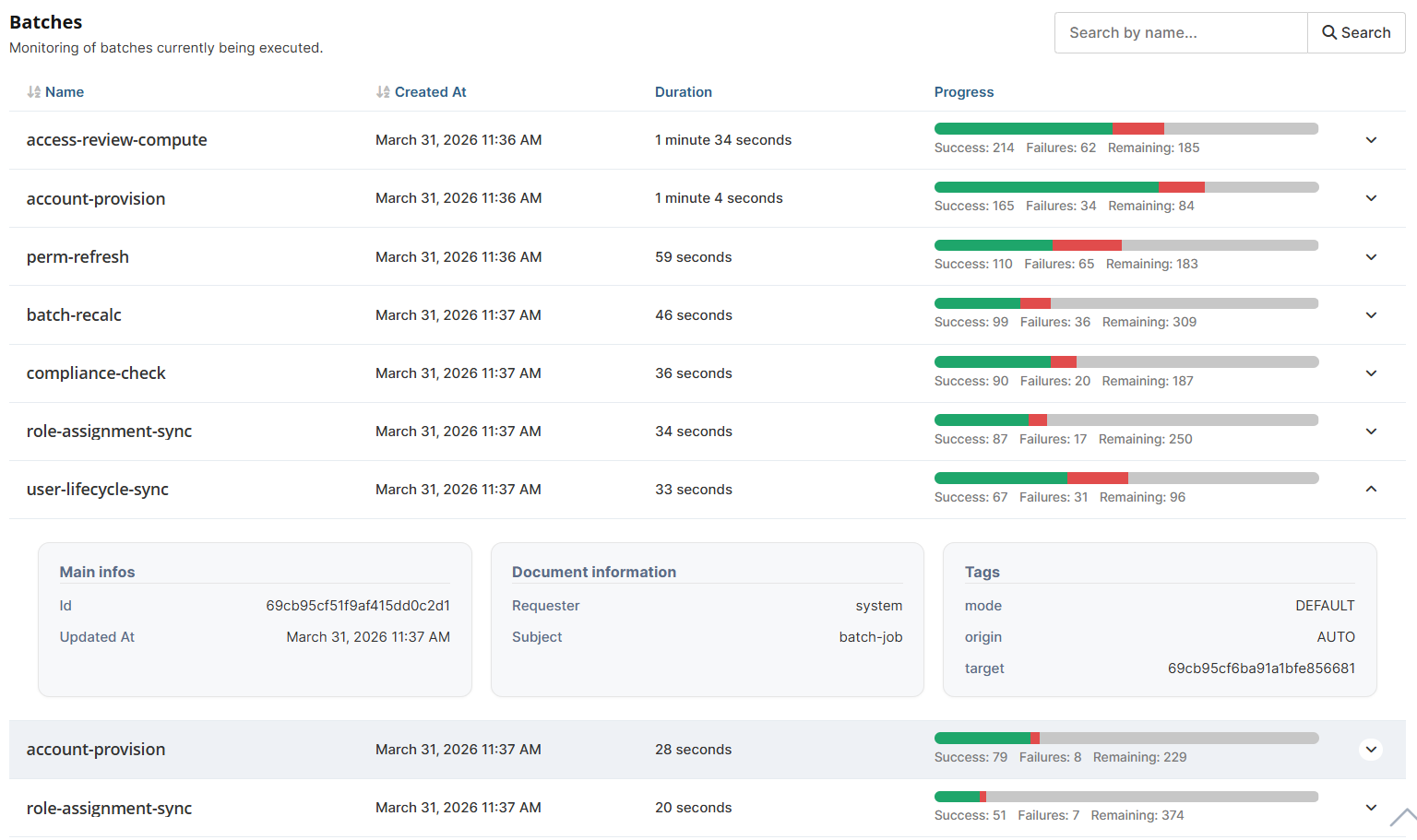
The "list" section displays Distributed Batches. We show the monitoring of batches currently being executed.
2) History tab
You can filter your data using the provided filter.
However, you cannot filter for a period longer than 12 months (1 year).

XY Chart
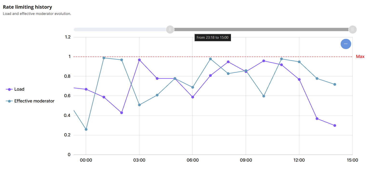
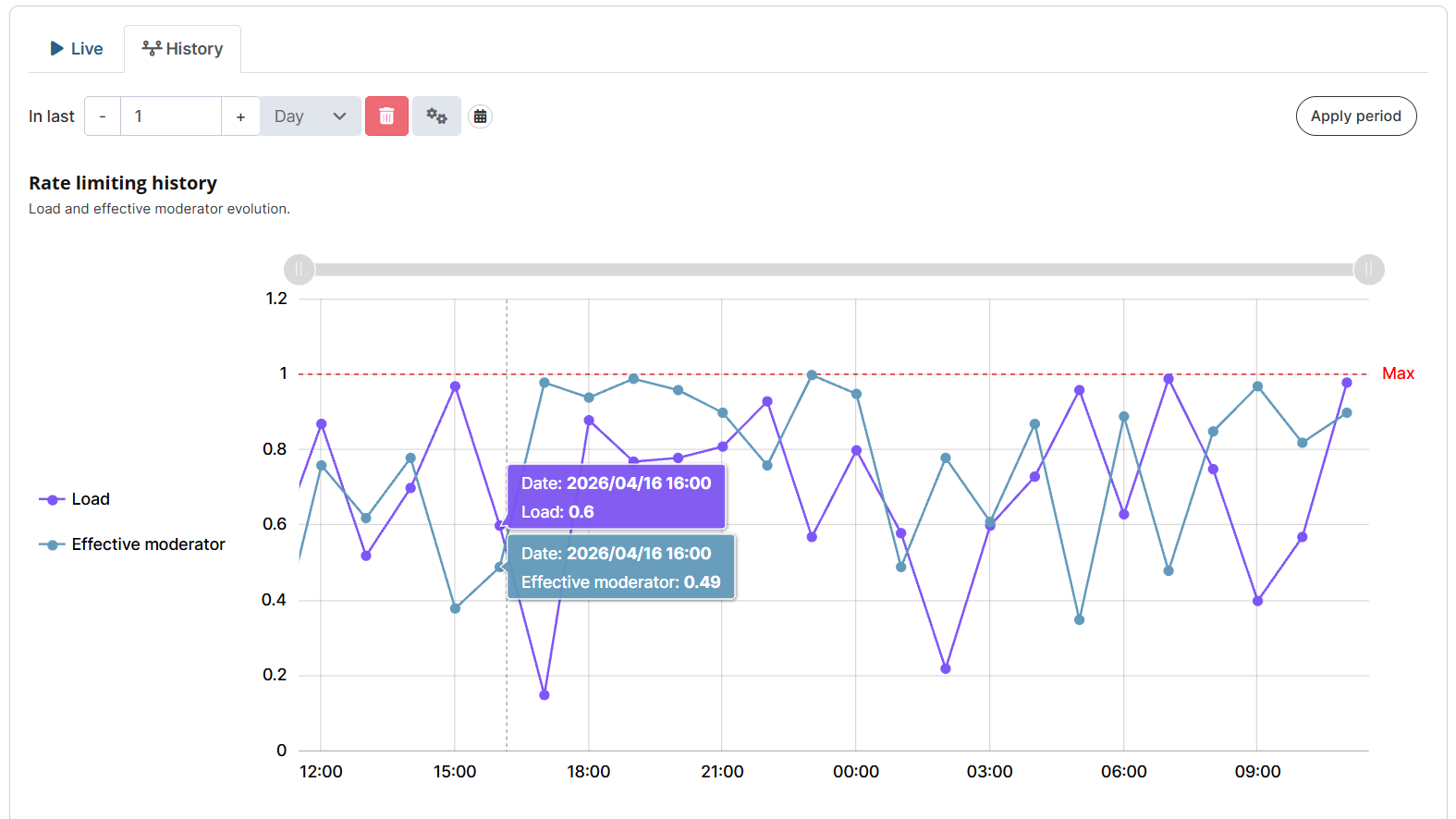
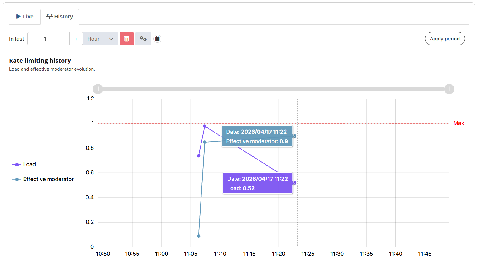
The "XY Chart" section displays the Rate limiting history. We show the evolution of the load and effective moderator over time.
-
If you choose to filter for a period greater than 2 days, the XY Chart will group the data points by hour, with an aggregation that displays the "maximum load" and "minimum effective moderator" for each hour.
-
f you choose to filter for a period between 1 hour and 2 days, the XY Chart will group the data points by minutes, with an aggregation that displays the "maximum load" and "minimum effective moderator" for each minute.
-
If you choose to filter for a period of 1 hour or less, the XY Chart will display all data points per second for the selected time period.
You can click on the legend to hide/show the load and effective moderator curves.
Gantt Chart
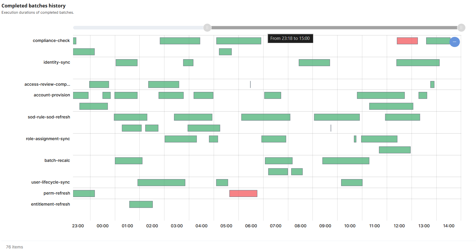
The "Gantt Chart" section corresponds to the Distributed batches history. It displays the execution durations of completed batches.
The Gantt Chart thus displays the completed batches from the most recent to the oldest.
-
Batches marked in green indicate that the batch was 100% successful.
-
Batches marked in red indicate that the batch had at least one failure.
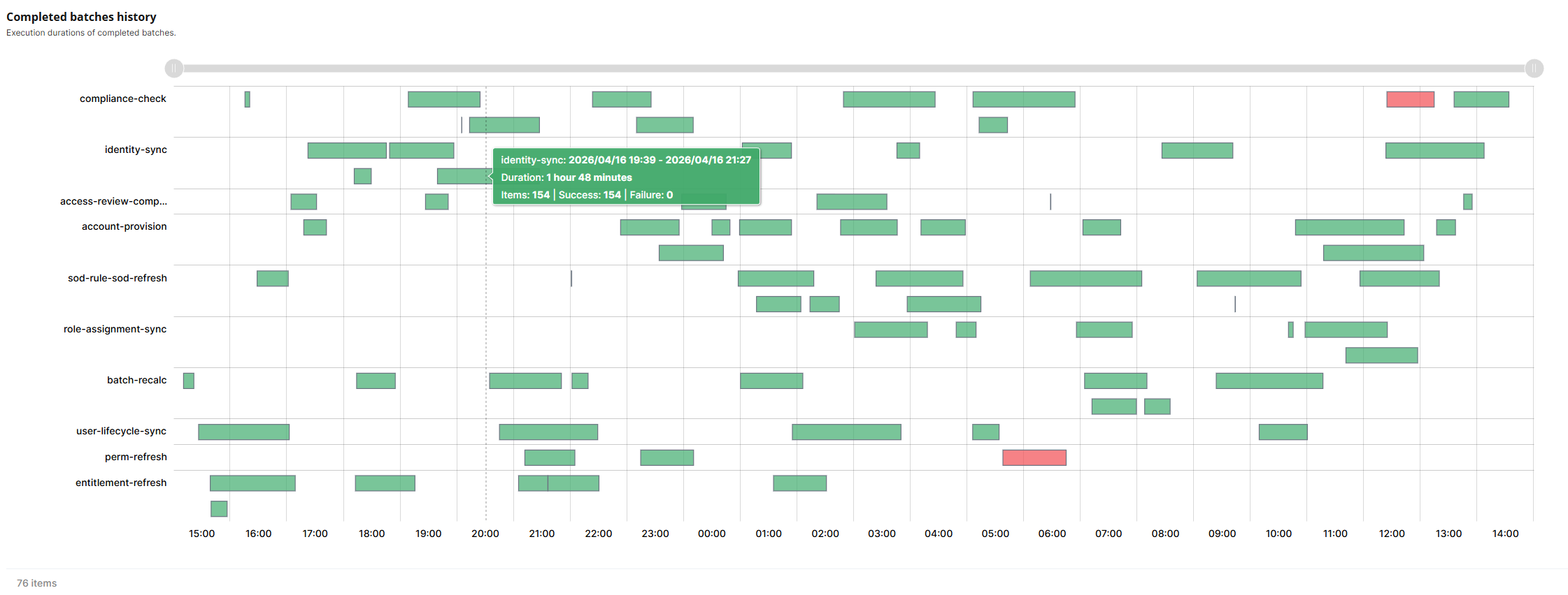
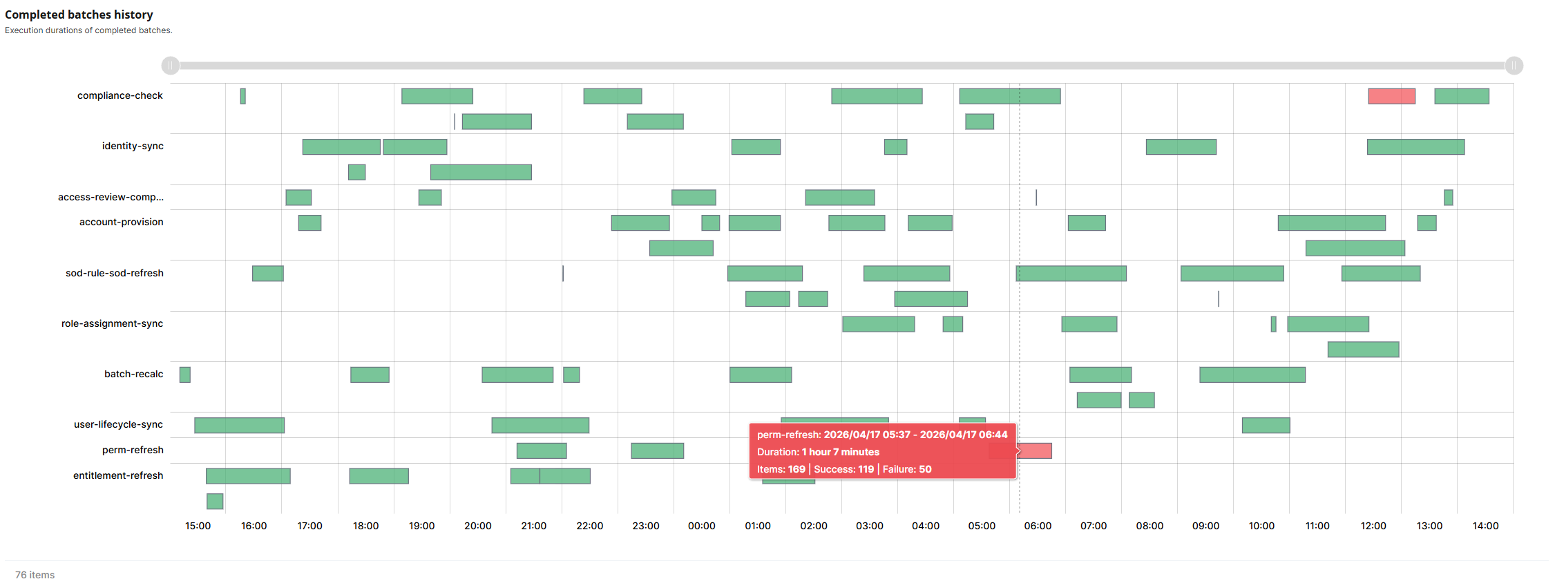
Chart synchronization
The two charts (XY and Gantt) are bidirectionally synchronized at the ScrollbarX and CursorX levels. They share the exact same X-axis, based on the date.
Therefore, if you zoom in or out on one of the charts:
-
Via the scrollbar at the top of each chart (by hover your mouse over the scrollbar, you will be able to see the time period you are currently viewing).
-
Via the cursor directly within the chart.
The zoom will then be applied to the other chart.