This page explains how to configure the visual theme of the portal and login pages.
You can:
-
Define reference colors. These colors guide the styling of various page elements.
-
Customize interface elements.
-
Upload logos.
-
Add optional background images and CSS.
You can configure the theme colors in the following ways:
-
Use a straight CSS color in hexadecimal format (e.g.,
#fda3b6) -
Reference one of the defined theme colors (e.g.,
@accent) -
Apply a SASS directive that may include a reference color (e.g.,
darken(@accent, 10%))
You can also use the available predefined templates and customize each component individually.
Configuration
Open the Configuration Interface
To access the configuration, go to Customization → Theme in the Admin Portal.
In the dropdown at the top of the editor, select Standard to configure the theme.

Saving Changes
The theme customization editor does not save changes automatically.
Click Update before closing the editor or navigating away.
If you leave the page without clicking Update, the system will discard all your changes.

Use a Template (Optional)
You can either start with a template or manually adjust each configuration area.
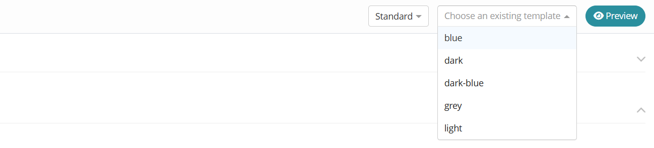
If you want to reuse an existing theme template, open the Choose an existing template dropdown. By clicking on the Preview button, you can see how the theme will appear.
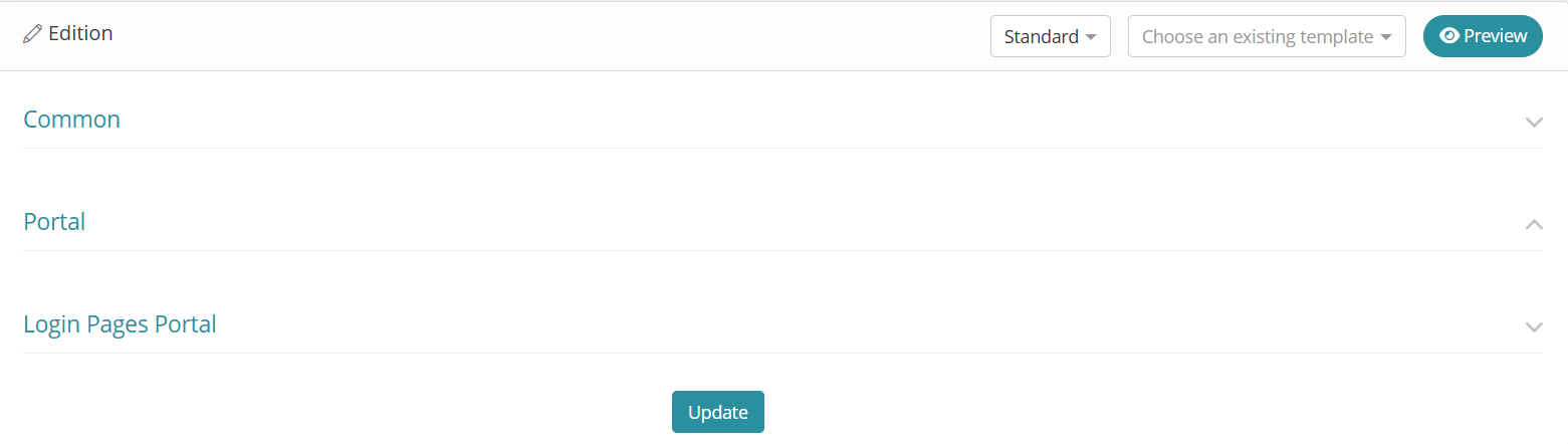
Theme configuration includes three expandable sections:
-
Common: Reference colors
-
Portal: Identity Management (IM) interface customization
-
Login Pages Portal: Access Management (AM) interface customization
Set Reference Colors (Common)
If you choose to manually customize the portal, you can define the reference colors for the main elements in the Common section. Each reference color must be a valid CSS color value.
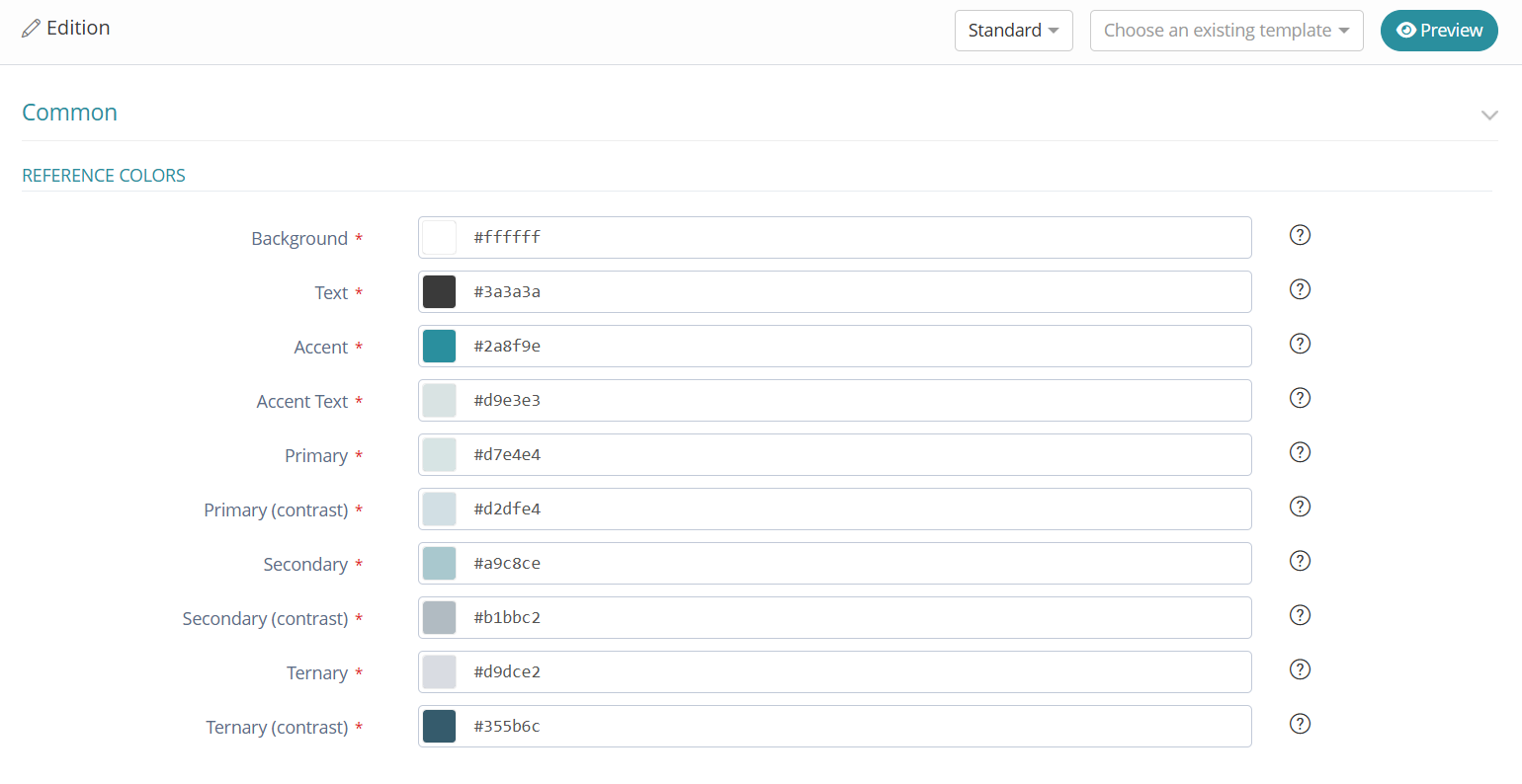
You can hover over the question mark next to each field in the Admin Portal to see which part of the portal the color applies to.
Customize the Portal Look (Portal)
Use the Portal section to adjust the visual style of the admin and user portals.
Customizing the Colors
After defining the reference colors in the Common section, use them to customize the portal. To do this, click one of the following buttons to the right of each field:
-
Color - Enter a CSS color.
-
Ref - Reference a defined color (e.g.
@accent) -
SASS - Use a SASS directive (e.g.
darken(@accent, 10%)).
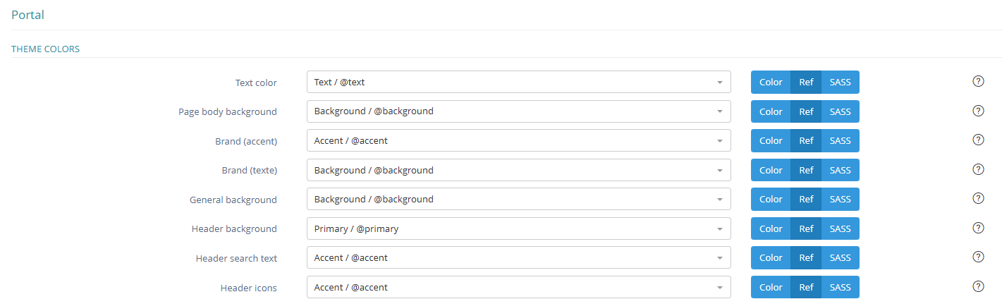
You can hover over the question mark next to each field in the Admin Portal to see which part of the portal the color applies to.
Add a Logo
Upload the logo in Customization - Assets - Create by clicking “Drop Here” or using drag and drop.
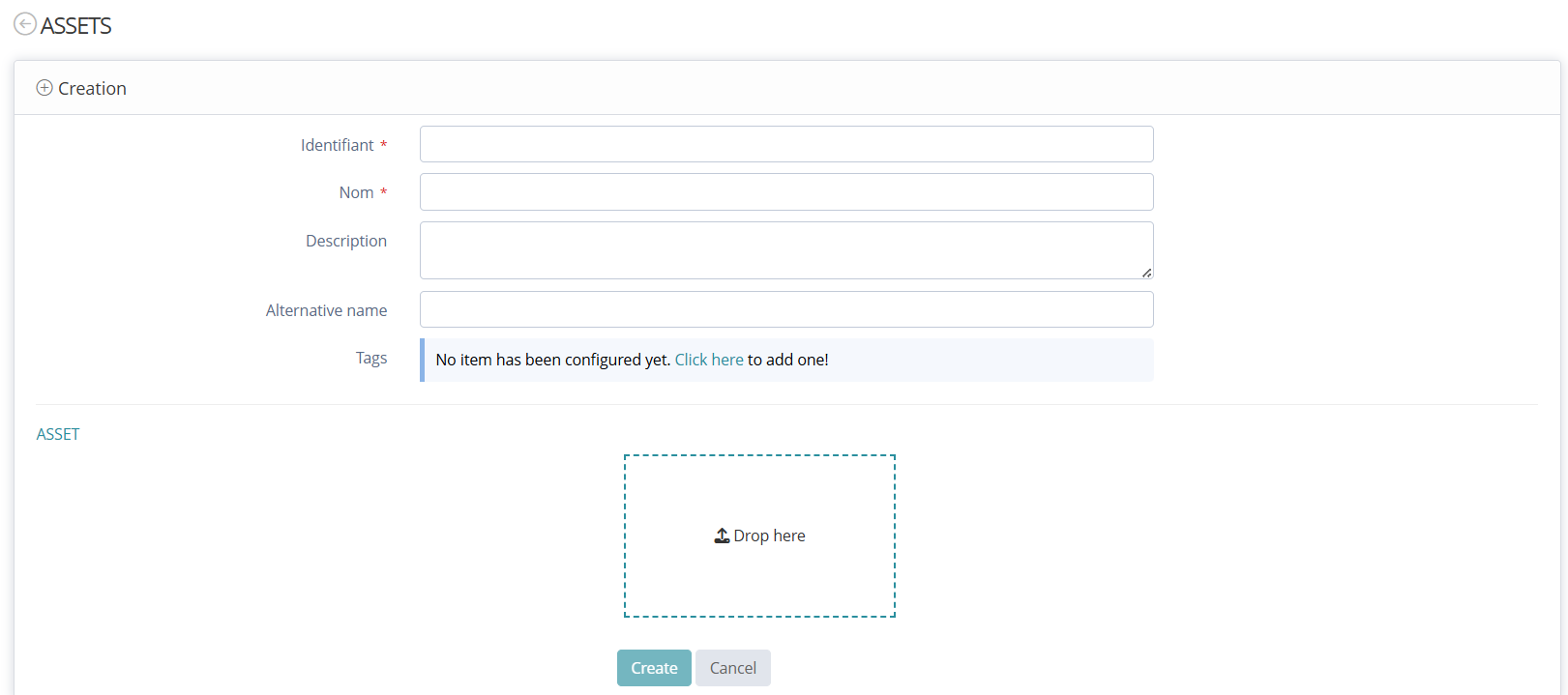
Then, in Customization - Theme, you can select the uploaded logo from the dropdown list.
Logos must be in GIF, PNG, or JPEG format and under 50KB. You can also add CSS styles directly to the Logo Style using the style attribute.

The main logo appears on the left side of the banner in both the admin and user portals.
Style the Login Pages (Login Pages Portal)
The Login Pages Portal theme defines the visual appearance of the tenant authentication pages.
After saving, theme changes applied to the login pages may take up to two minutes to appear on the tenant.
You can configure the following elements:
Set Theme Colors
Define the colors used for:
-
Primary and secondary buttons
-
Text
-
Highlights
Click the corresponding blue button to enter:
-
A CSS color value (e.g.
#23a327) -
A reference to a defined color (e.g.
@accent) -
A SASS directive (e.g.
darken(@accent, 10%))
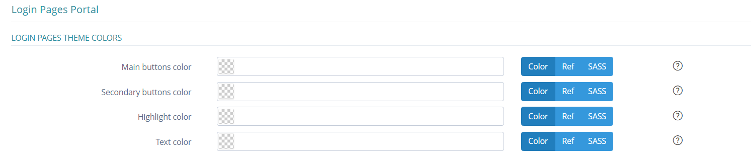
Add a Logo
Upload the logo in Customization - Assets - Create by clicking “Drop Here” or using drag and drop.
Then, under Login Pages Logo, select the desired logo from the dropdown menu. You can apply inline CSS to the logo (for example, to adjust size or alignment).

Add a Background Image
Upload the image in Customization - Assets - Create by clicking “Drop Here” or using drag and drop.
Then, under Login Pages Background Image Customization, select the desired image from the dropdown menu. You can apply inline CSS to control image size, position, or opacity.

Write Custom CSS
Use custom CSS to override or extend the login page styling.
Enter your CSS directly into the Login Pages Global CSS Customization field. The system injects this as a <style> block into the login page.
Any rules you define will override the existing theme styles.
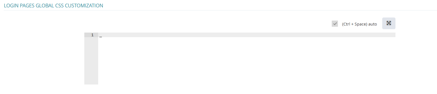
Accessibility and Contrast Guidance
Make sure your color choices provide sufficient contrast.
To meet accessibility standards, each element should be AA-compliant according to the Web Content Accessibility Guidelines (WCAG).
You can check contrast using tools such as:
Also consider different types of visual impairments when selecting your color palette.
These tools can help:
-
Who Can Use – test accessibility across user contexts
-
Colorblind Simulator – simulate how your palette appears to users with various types of color blindness
Read Next
-
Assets Assets allows to configure theme/design asset resources such as logo(s), favicon ....
-
Theme -
Translation Translation configuration allows to customize the interface by adapting it to different languages. It covers elements such as labels, buttons, system messages, and authentication-related text.
-
Icon All information you need about icon usage in Memority.
-
Fragments Fragments let you add extra UI components to the login interface.