
Usage
Icons display can be customized in several places to fit the purpose of action buttons or titles.
These icons comes from the Font Awesome 6 (Free plan) library.
In order to use the icons:
-
Search the wanted icon on the Font Awesome website (the “Free” filter should be used)
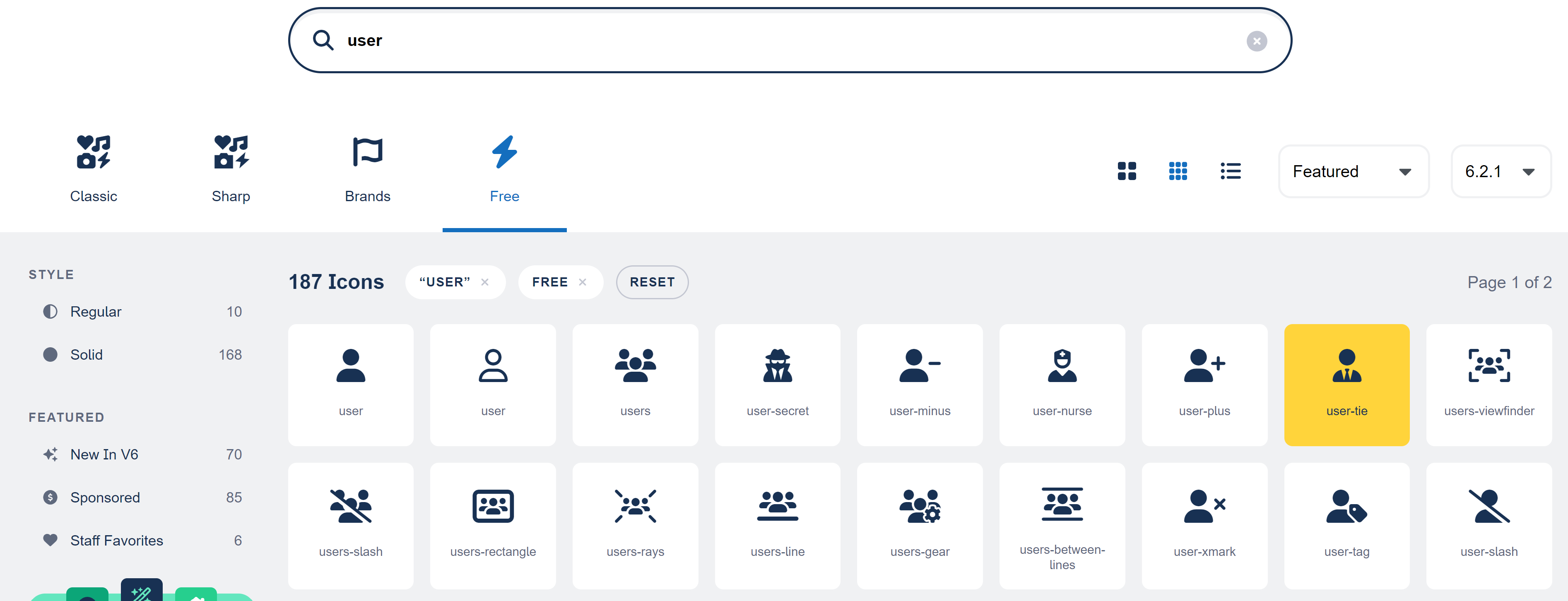
2. Click the icon
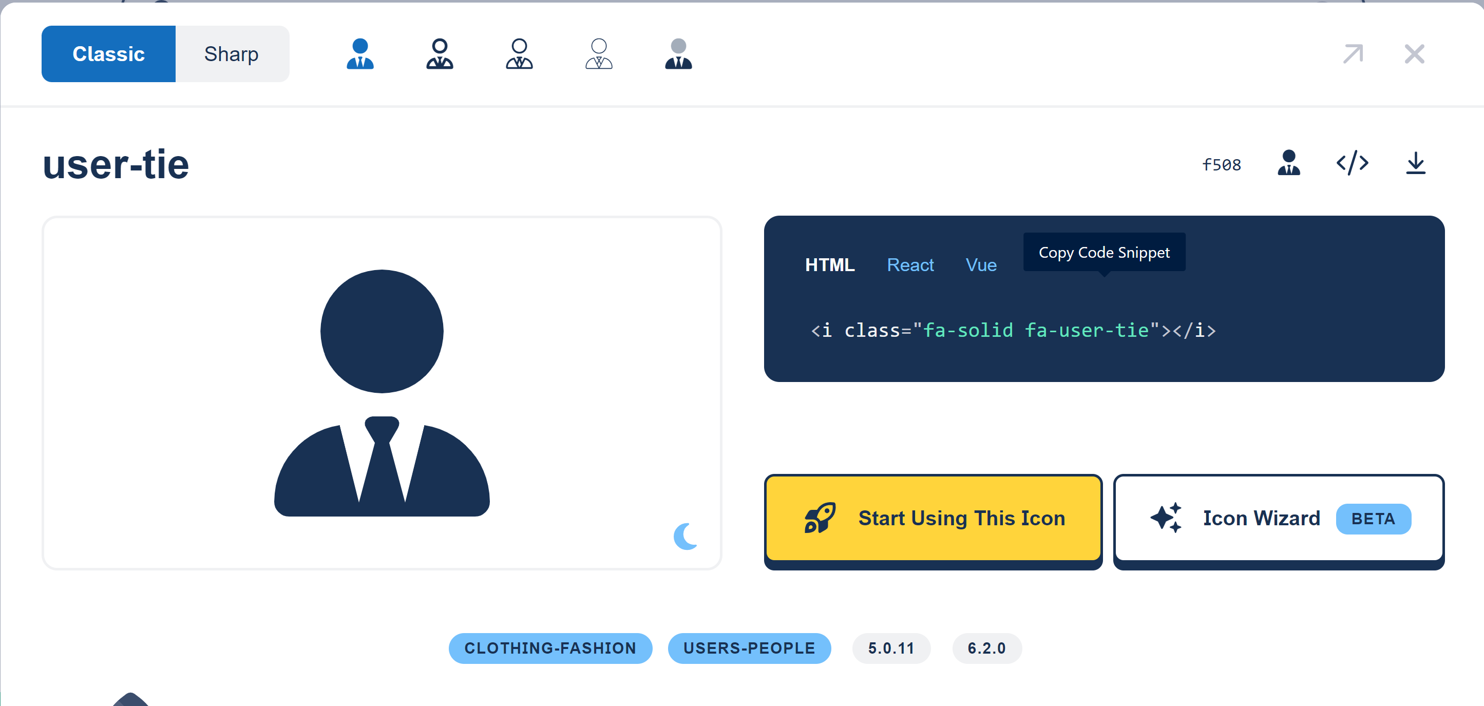
3. Ensure that you are using the “Classic” and “Solid” style
4. Copy the CSS selector (in this example “fa-solid fa-user-tie”)
5. This value is the one you should provide in the configuration element requiring an icon.
Example for an action button:
<screen>
	<views>
		<view>
			<sections>
				<section id="test-section-1">
					<layout>SINGLE</layout>
					<frame>
						<actions>
							<action id="user-tie-action" xsi:type="ctdbum:ButtonWidgetType">
								<align>RIGHT</align>
                                <borderless>false</borderless>
                                <circle>true</circle>
                                <color>default</color>
                                <icon>fa-solid fa-user-tie</icon><!-- Configure the icon to display (user with a tie) -->
                                <label>true</label>
                                <link>feature://test_feature/{routeObjectId}</link>
                                <linkTarget>SELF</linkTarget>
                                <outline>false</outline>
                                <size>SM</size>
                           </action>
						</actions>
						<collapsible>true</collapsible>
						<display>PORTLET</display>
						<initiallyCollapsed>false</initiallyCollapsed>
						<title>true</title>
					</frame>
					<columns></columns>
				</section>
			</sections>
		</view>
	</views>
</screen>
Read Next
-
Assets Assets allows to configure theme/design asset resources such as logo(s), favicon ....
-
Theme Theme customization allows users to define a set of reference colors. These colors guide the styling of various page elements, particularly the header and the menu, helping maintain a consistent visual identity.
-
Translation Translation configuration allows to customize the interface by adapting it to different languages. It covers elements such as labels, buttons, system messages, and authentication-related text.
-
Icon -
Fragments Fragments let you add extra UI components to the login interface.